


GottMik’s logo suite draws inspiration from classic rock and heavy metal iconography — reframed through a high-fashion, drag-forward lens. The goal was to create a brand system that feels iconic, confrontational, and instantly recognizable.
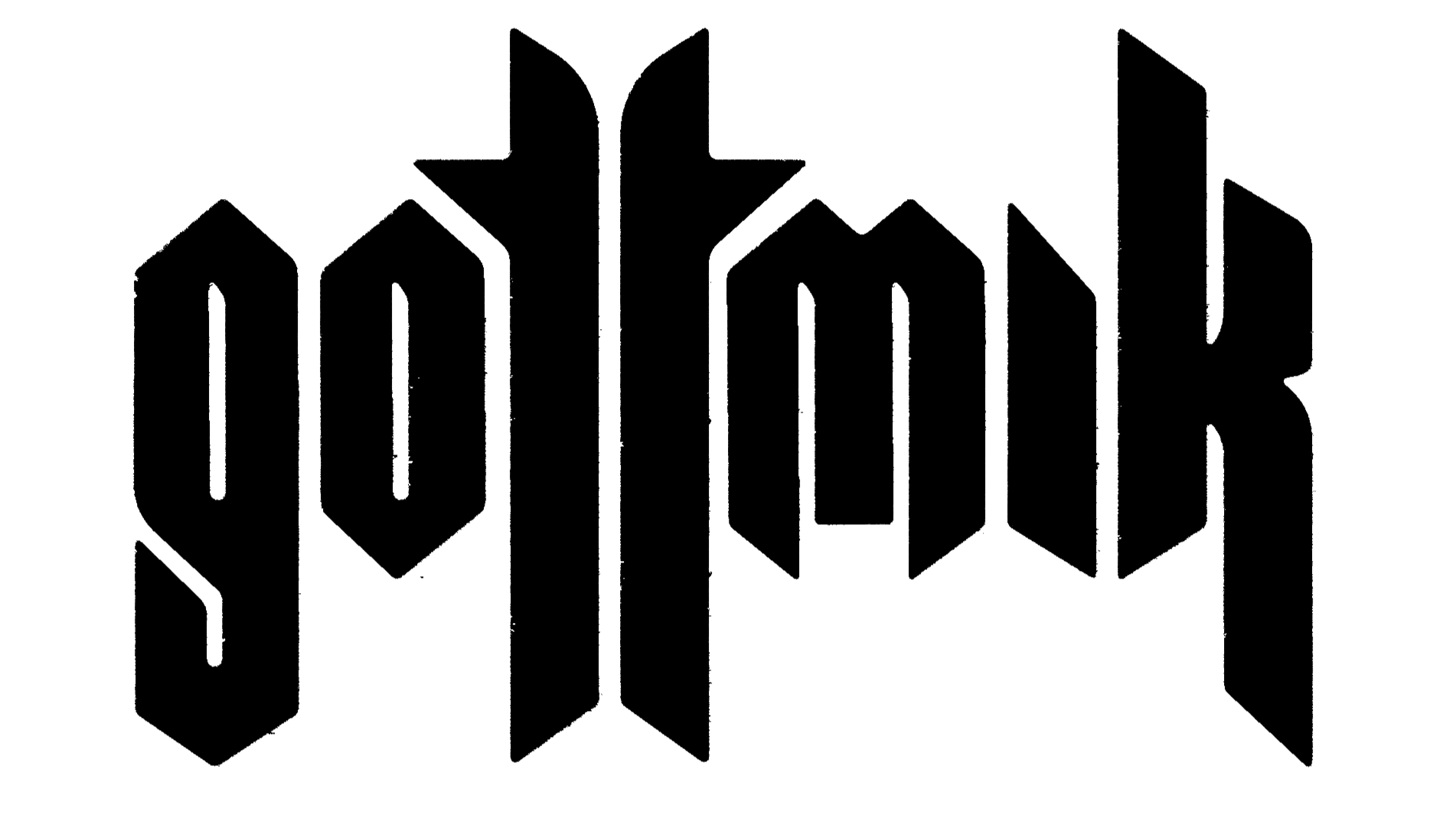
The wordmarks angular letterforms and mirrored vertical structure give the type a sense of symmetry and strength, transforming it from typography into a graphic object. The sharp terminals and condensed stance create tension, while the clean execution keeps it elevated and modern. It’s declarative without feeling nostalgic — confident and built for high visibility across merchandise, digital, and large-scale applications.
The emblem functions as a personal sigil. Its elongated vertical axis and horned extensions create a sense of power and intention, creating a custom sharp, and symbolic crest. Subtly embedded within the form is a nod to GottMik’s trans identity, referencing gender symbolism in a way that feels designed versus literal.
Together, the system balances edge with refinement. It captures strength, transformation, and hard-edge — positioning GottMik as a iconic visual force.
GottMik
Role: Creative Direction & Branding
Industry: Entertainment / Music