Client: Project in collaboration with HeadCount / MTV / World of Wonder
Role: Creative Director
In the fall of 2024, I spearheaded the "You Betta Vote!" mural campaign in Chicago's Northalsted neighborhood in collaboration with HeadCount, MTV and World of Wonder. Drawing inspiration from a twist on RuPaul's iconic catchphrase “You Betta Werk”, this initiative aimed to encourage civic engagement within the community. I was responsible for conceptualizing, pitching, budgeting, and designing the 16 foot wide by 9 foot high hi-resolution mural, ensuring its message resonated with a diverse audience.
The "You Betta Vote!" mural was designed to be a bold, high-impact visual statement that fused activism with vibrant street art. The mural featured a striking 3D metallic text treatment, with “YOU” rendered in the colors of the Progress Pride Flag, symbolizing inclusivity and representation. The phrase “BETTA VOTE!” emblazoned in Stars and Stripes, reinforcing the message of civic duty through a patriotic lens. Surrounding the typography, the mural incorporated a collage of posters and graffiti-style elements, addressing key election issues, meme + queer culture, and urging passersby to take action. A cleverly integrated QR code, framed by a graffiti tag reading “Scan Me” with an arrow, linked directly to voter registration resources.
The mural’s aesthetic was designed to be both eye-catching and engaging, pulling inspiration from classic propaganda posters while embracing a contemporary, street-art feel. Its layered textures and bold color contrasts made it an unmissable fixture in the Northalsted neighborhood, ensuring the message resonated with Chicago’s diverse and politically active community.
The mural garnered significant attention and was featured in The Chicago Sun-Times, noting its strategic placement in a high-traffic area to maximize visibility and promote voter participation. The campaign also received support from organizations like Feminist, which emphasized the importance of voter registration ahead of the elections.
Client: Britney Spears
Role: Creative Director + Graphic Designer
Collaborating with Britney Spears has been an incredible highlight in my career — The “Legendary Quotes” project was about showcasing Britney’s resilience and journey for independence. It’s a narrative that resonates deeply with her queer fans because many of us have experienced uphill battles, faced adversity, and found strength on the other side, just like Britney. Growing up with her, we’ve witnessed her journey to independence, and all we want now is to see her exist and thrive on her own terms. It’s a story of strength, solidarity, and the shared dream for a better future.
As the creative lead on this project, launched alongside Britney Spears’ highly anticipated book, The Woman In Me, I conceptualized and pitched a capsule collection of 15 designs celebrating her most iconic and empowering quotes. Collaborating closely with Britney’s team, we refined the selection to 6 standout designs and another 3 from her merch company, which debuted on her official website and were showcased across all her social media platforms, engaging millions of fans worldwide.
Client: Britney Spears
Role: Creative Director + Graphic Designer
In celebration of the 25th anniversary of Britney Spears' record-breaking debut album, "...Baby One More Time", I had the privilege of serving as the creative director and designer for an exclusive capsule collection. This collection was launched on Britney's official webstore and promoted across her social media channels to commemorate this significant milestone.
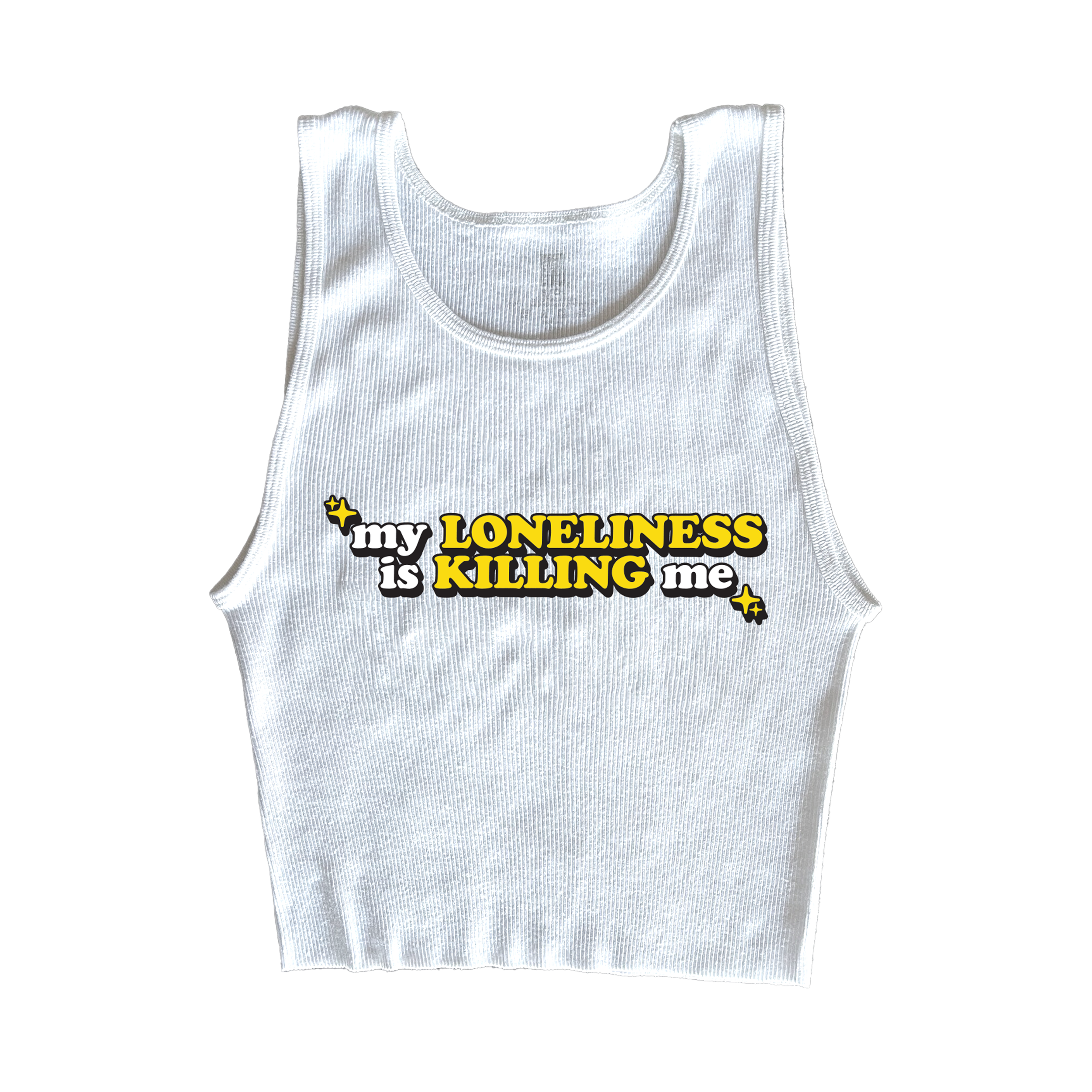
Drawing inspiration from the iconic schoolgirl aesthetic of the "...Baby One More Time" music video, I conceptualized a range of apparel that resonates with both nostalgia and contemporary fashion. The collection features a limited edition letterman jacket, embodying the classic varsity style, alongside crop tanks emblazoned with phrases like "Give Me a Sign" and "My Loneliness," directly referencing lyrics from the hit song. To cater to diverse preferences and ensure accessibility, the collection includes vintage-inspired t-shirts, hoodies, athletic shorts, and a matching sweatpants and sweater set, all designed with scalable pricing to offer something for every fan.
Client: Warner Records
Role: Art Director + Graphic Designer
Being both the art director and graphic designer, I lead creating a visually striking cover art for David Guetta and Bebe Rexha's viral hit single "I'm Good (Blue)" within 48 hours. Inspired by the song's 90's nostalgic vibe, the design blends modern aesthetics with a playful nod to the iconic Eiffel 65 track "Blue (Da Ba Dee)". The artwork features bold chromatic typography, vibrant blue tones, and dynamic lighting effects; capturing the track's upbeat, feel-good energy while maintaining a sleek, modern edge. "I'm Good (Blue)" garnered international success by attaining the number one position on rankings in 20 countries, soared to #1 on iTunes USA and has amassed over 2 billion streams worldwide, solidifying its place as a cultural phenomenon. It stands as the second longest-running chart-topper in the Dance/Electronic chart, maintaining this position for 55 weeks and has received multiple diamond, gold and platinum certifications and various awards.
It also earned me my first RIAA Certified Platinum Record!!
Client: Shea Couleé
Role: Producer + Editor
For Shea Couleé’s music video Material, I played a dual role in both production and post-production, ensuring a seamless transition from concept to final edit. The video, which premiered exclusively with Paper Magazine, is a high-glam, high-energy visual celebrating fashion, luxury, and empowerment.
As Producer and Art Director, I was deeply involved in the pre-production and on-set execution, including location scouting, art direction, and on-set supervision across a three-day shoot. My role required ensuring every shot was camera-perfect, meeting tight daily filming deadlines, and balancing an intricate production schedule that coincided with Shea’s tour visuals shoot and an editorial photoshoot.
In post-production, I took control of the editing process, selecting and refining footage with Shea to create a visually dynamic final cut. I added VHS textures, custom transition effects, and precise color grading to enhance the video’s nostalgic yet futuristic aesthetic. Additionally, I meticulously synced slowed-down and sped-up footage to maintain perfect frame rate continuity.
With its in-your-face visuals, Material is a testament to my ability to manage large-scale productions, produce compelling visuals, and seamlessly execute high-level editing work — blending both creative vision and technical precision.
Client: Shea Couleé presents The Love Ball
Role: Producer, Visual Director + Art Director
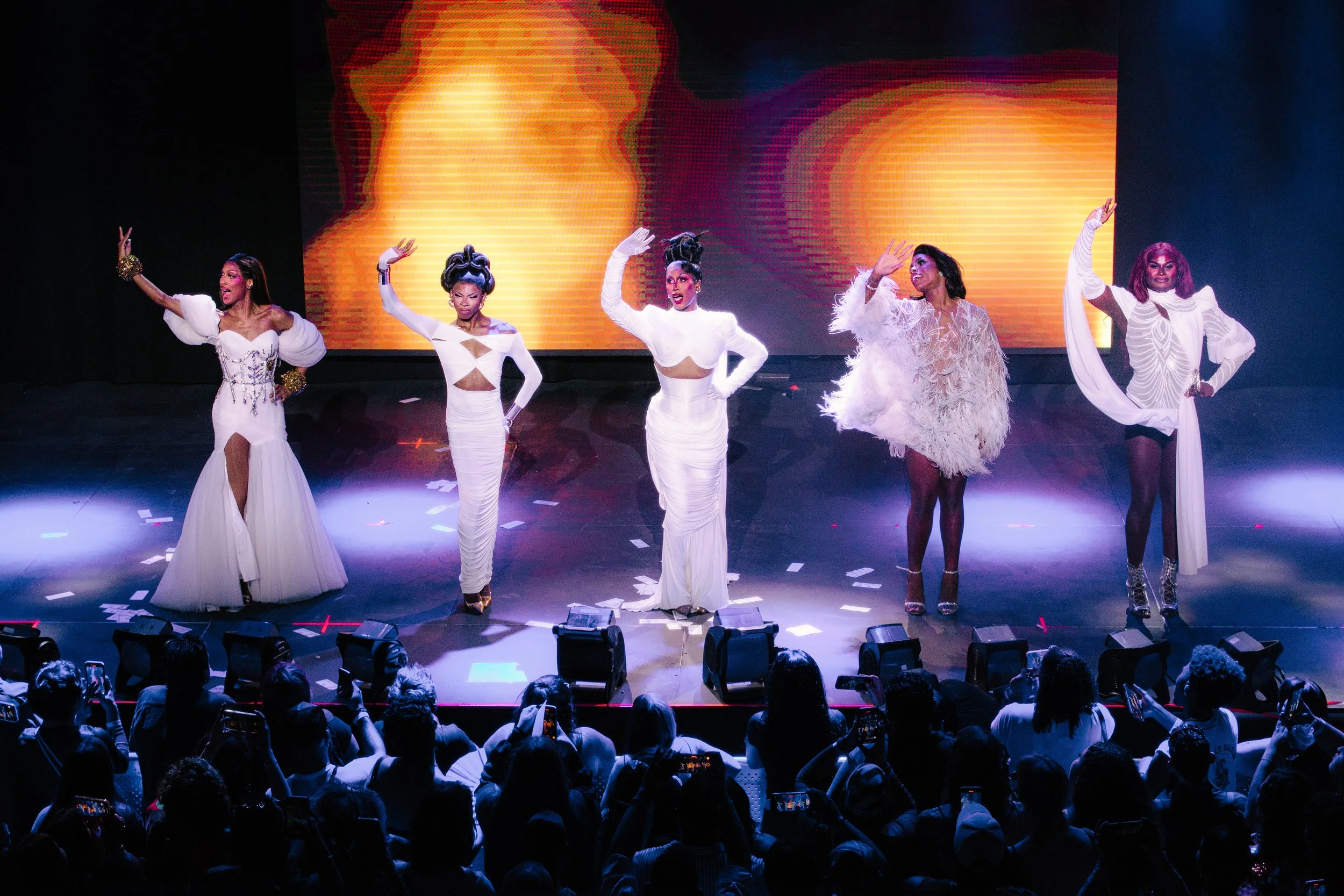
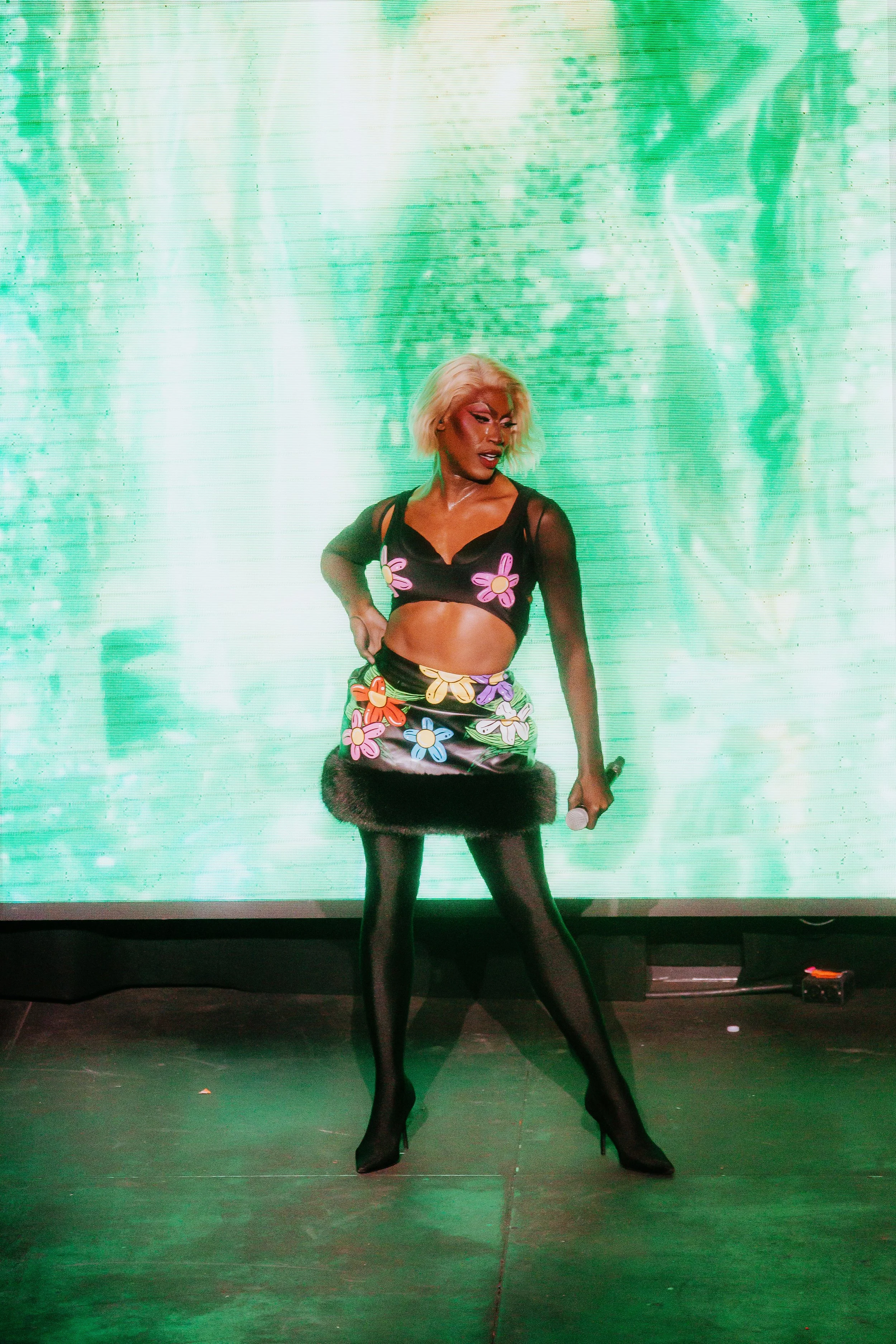
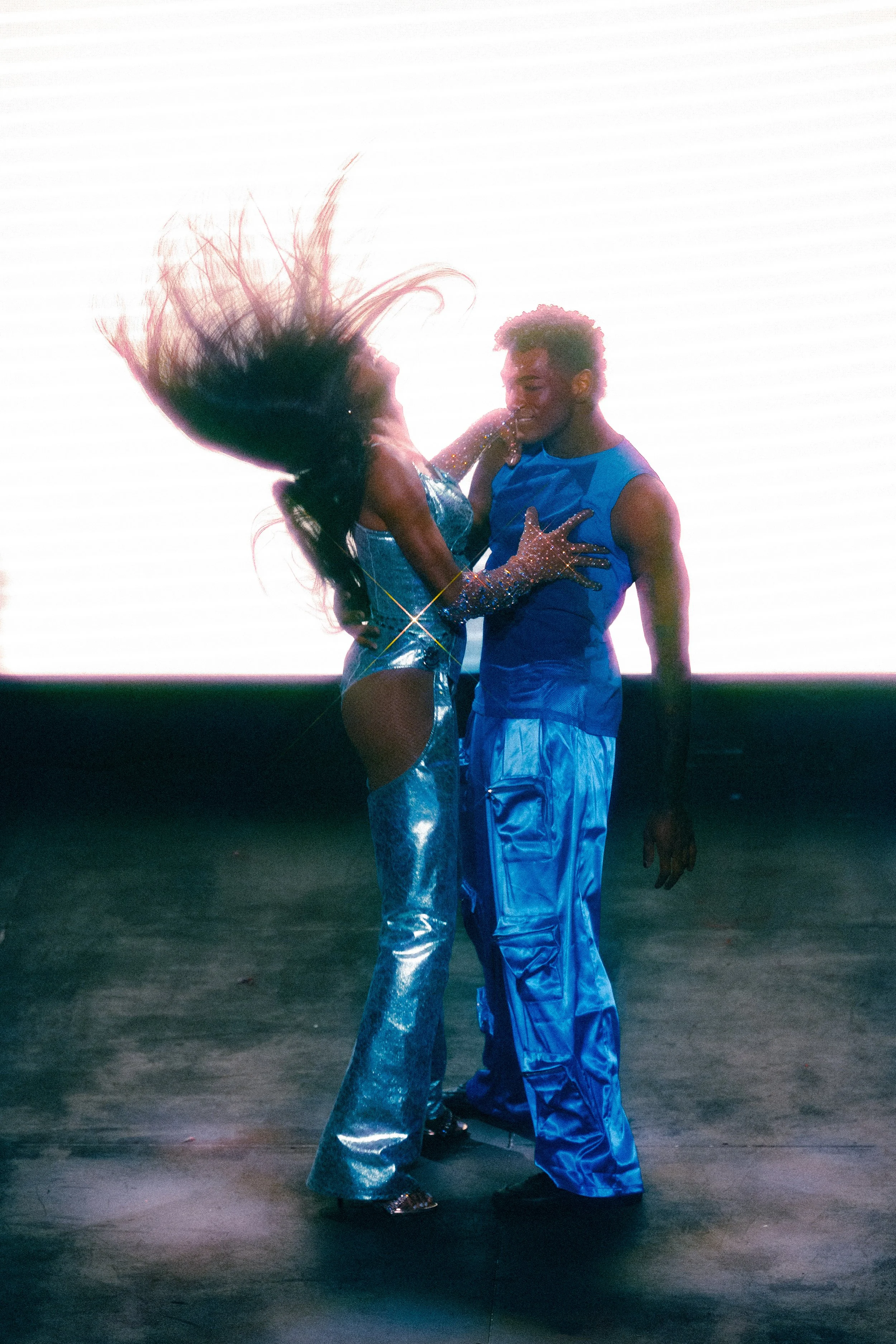
The Love Ball Tour was a high-profile, sold-out live production featuring six of the most celebrated names in drag: Shea Couleé, Monet X Change, Jaida Essence Hall, Lala Ri, Tayce, and Luxx London Noir. Spanning Chicago, Atlanta, NYC, and LA, the show required a seamless fusion of live event production, visual storytelling, and brand identity, all executed under high-pressure conditions. As Producer, Visual Director, and Art Director, I played a critical, multi-faceted role in both the creative and logistical success of the tour.
As Producer, I was deeply involved in the full-scale execution of the tour, ensuring that every moving part — from pre-production planning to post-show wrap-ups — ran smoothly. I oversaw all major logistics, including budget management, performer and crew travel arrangements, accommodations, and logistics for rehearsals. The responsibility extended to coordinating venue operations, ensuring seamless load-ins, soundchecks, run-of-show, and post-show load-outs in each city. Given the high-energy and fast-paced nature of a multi-city live production, flexibility and problem-solving were crucial. Alongside Team Couleé, I navigated last-minute changes, technical constraints, and artist needs, ensuring a flawless execution in high-pressure environments.
As Visual Director, I was responsible for helping to craft the entire visual landscape of the two-hour show. Every performance required a unique visual identity, carefully designed to be bold and captivating while remaining non-intrusive as well as complimenting each headliners outfits. I developed and programmed the opening, transitions, intermission, and closing visuals, ensuring a seamless flow between all performances. Beyond creation, I took full control of the technical execution, testing, programming, and running all visuals live in real-time during each sold-out show. Additionally, I designed custom streaming videos for Patreon-exclusive content, expanding the reach of the production beyond the stage. Managing both the creative development and live execution of these visuals under high-pressure conditions required a blend of vision, expertise, and timing.
As Art Director, I worked with Shea to develop the official key art and branding for the tour. This branding extended beyond just promotional materials — it set the visual tone for the entire production, reinforcing the strong and cohesive identity that Team Couleé has become known for. I designed all promotional materials for social media, day-of-show documents, and marketing visuals, ensuring consistency across platforms. Every visual was carefully crafted to elevate the tour’s brand presence, making it recognizable and visually impactful both online and in the physical production space as well as enticing to sponsors.
The Love Ball Tour was a massive success, selling out in every city and delivering a visually-arresting, tightly executed production. My work across production, visual design, and branding ensured that every aspect of the tour — from logistics to creative direction — was executed at it’s highest level. This project demonstrated my ability to lead under pressure, manage large-scale event logistics, and deliver bold, high-impact creative work across multiple disciplines.
photos by Sophie Harris Photography
Client: Erika Jayne
Role: Art Director + Graphic Designer
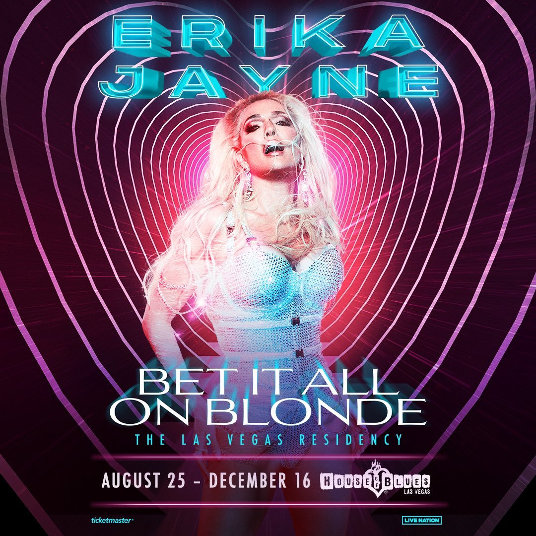
Branding one of the most iconic Real Housewives, Erika Jayne, was an incredible opportunity. As the art director and graphic artist, I collaborated with Erika's Creative Director, Mikey Minden, to develop bold and stylish branding options that reflect Erika’s glamorous and fierce persona.
The final monogram logo is inspired by high-fashion branding — bold yet impactful, embodying Erika’s edgy aesthetic. Finished with a lux gilded gold stylization, the logo made a striking debut on The Real Housewives of Beverly Hills Season 13 Finale Episode, when Erika performed at the iconic White Party. It was also heavily featured in Erika’ Bravo special Bet It All On Blonde, her Las Vegas residency, and across various Erika Jayne projects.
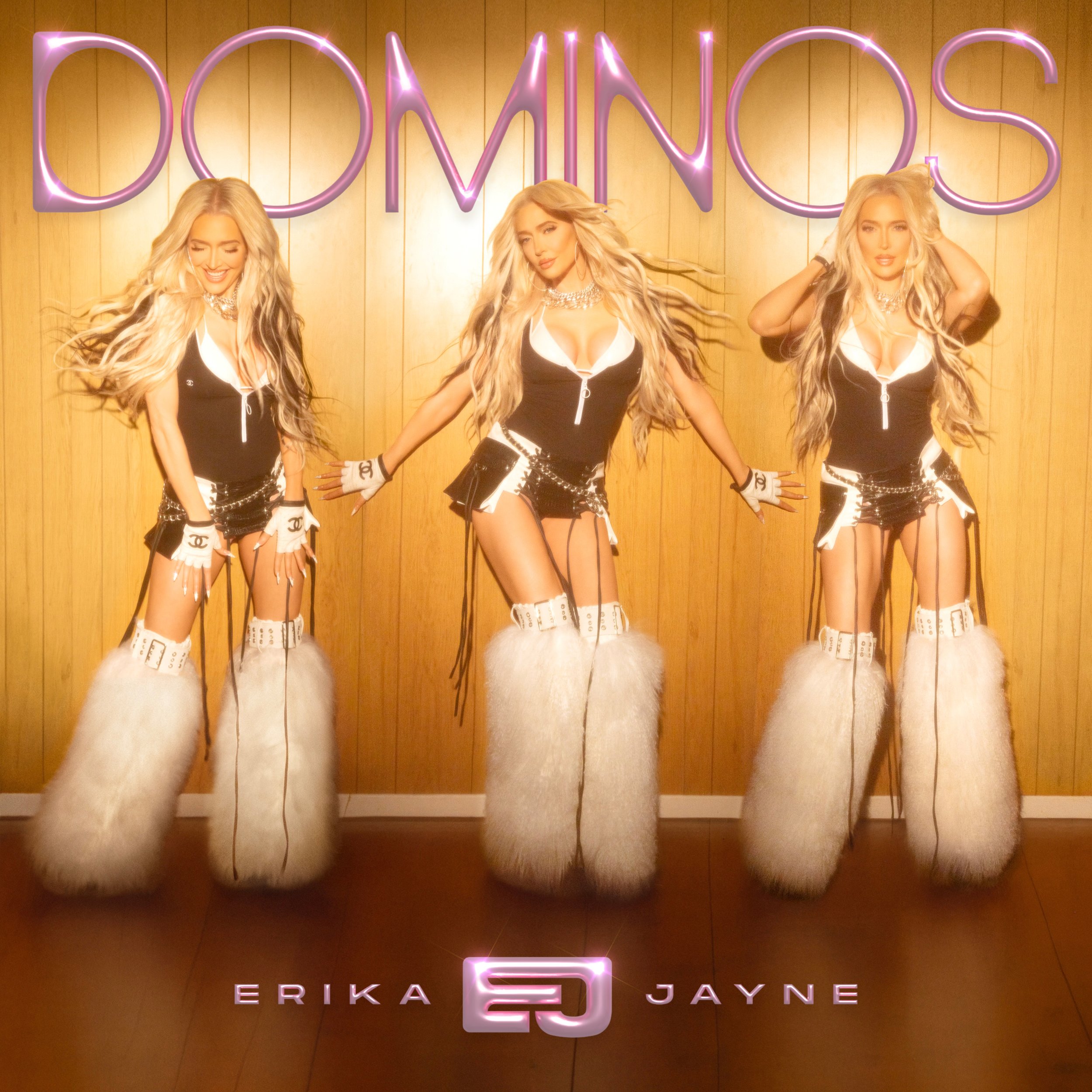
Beyond branding, my work extended to album artwork for her singles BOUNCE and DOMINOS, incorporating custom typography and signature stylizations to complement Erika’s visual identity and artistic evolution.


Client: GottMik + Violet Chachki
Role: Art Director + Graphic Designer
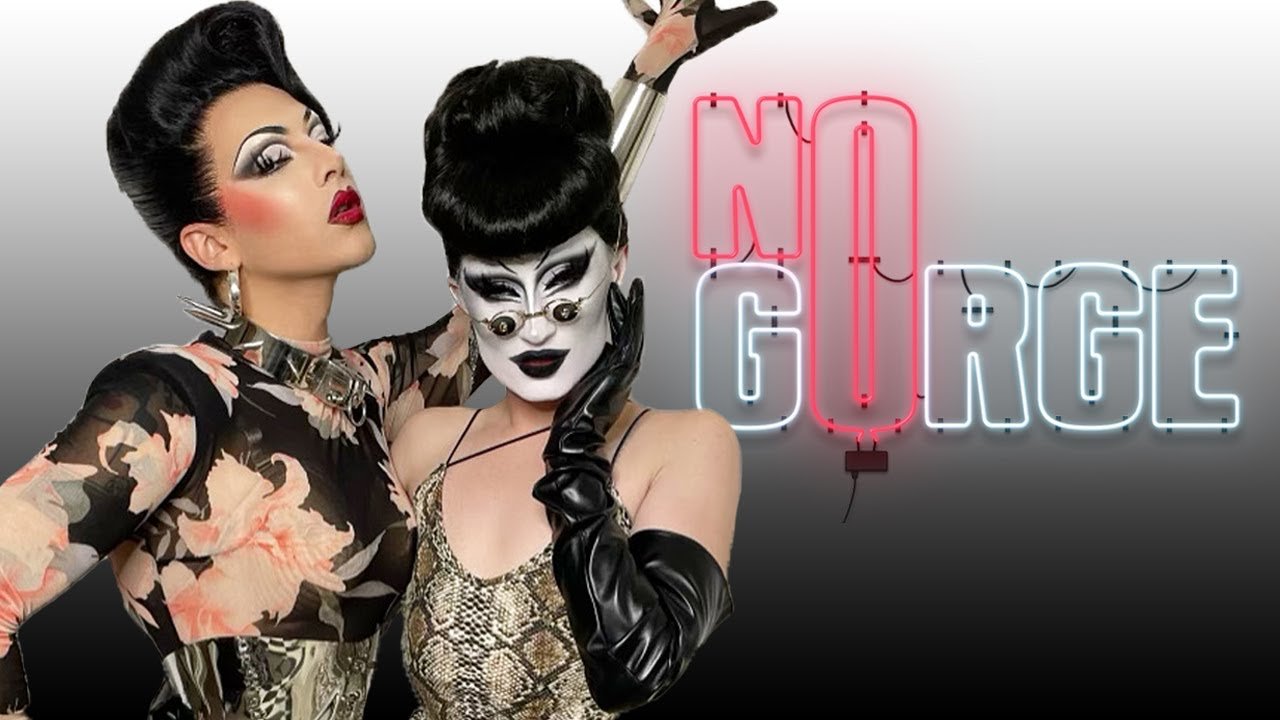
As the branding designer for No Gorge, the podcast hosted by GottMik and Violet Chachki, I developed a bold and instantly recognizable visual identity that reflects the duo’s sharp wit and avant-garde aesthetic. The typography design features a glowing neon-light piece, with “NO” illuminated in a vivid red neon glow and “GORGE” in a cool white neon. This contrast creates a dynamic effect, embodying the edgy, nightlife-inspired, fashionable energy that encapsulates Violet and GottMik’s signature styles as well as reinforcing the podcast’s irreverent and unapologetic brand identity.
This branding has extended across podcast visuals, promotional materials, and social media assets, creating a cohesive and impactful look across multiple platforms.
art by Angel Rivera
art by Angel Rivera
video by Angel Rivera
art by Angel Rivera
Client: QUEEN! Sundays at SmartBar
Role: Branding / Event Production / Creative Direction
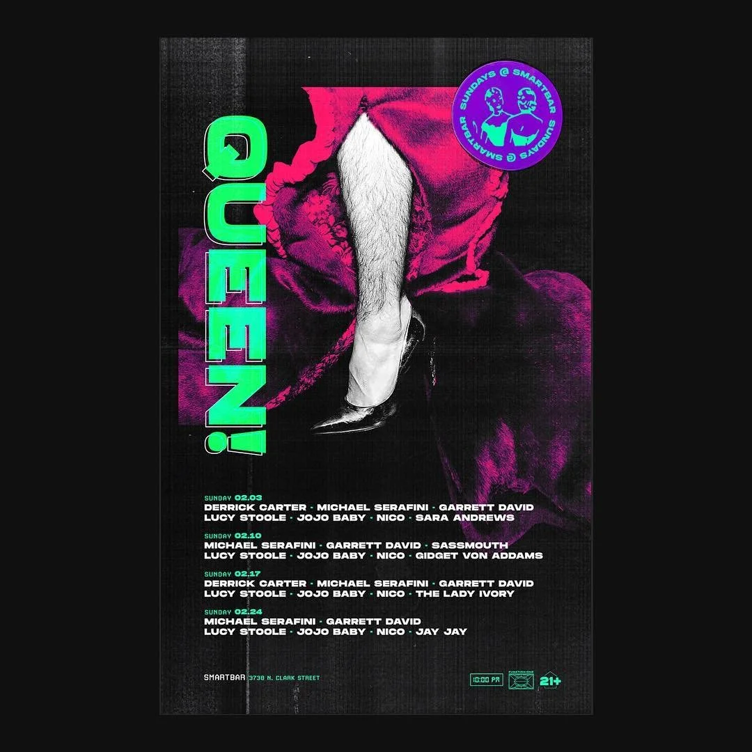
For nearly a decade, I played a pivotal role in producing, branding, and elevating QUEEN! Sundays at SmartBar, transforming it from a local event into a legendary, award-winning Chicago and LGBTQIA+ nightlife institution. As both producer and creative director, I was instrumental in not only cemeting its place as a staple in the house music and drag scenes but also in breaking attendance records for SmartBar’s 35+ year history, with lines wrapping around the block every Sunday night for resident DJs Derrick Carter, Michael Serafini and Garrett David plus resident hosts Jojo Baby, Lucy Stoole and Nico.
I initially joined QUEEN! when I was SmartBar’s Art Director, branding the party from its inception and developing its signature key art and branding. In 2015, when the event was at risk of cancellation, I stepped into a larger production role, using my expertise in social media, marketing, and Chicago’s evolving drag scene to revitalize and expand its reach. I launched the official QUEEN! Instagram, growing it to 12K+ followers, and implemented weekly event promotions on multiple platforms to engage and expand our audience. My contributions helped QUEEN! become one of the most influential dance parties in the city, earning widespread recognition in the nightlife, house music, LGBTQIA+ and drag industries.
QUEEN! was never a typical gay party — it is a Chicago house and disco utopia, a space where you won’t hear Top 40, but instead, world-class DJs spinning in an inclusive, high-energy underground venue. SmartBar itself has been the home of Chicago’s house music scene since 1982, hosting legendary names like Frankie Knuckles, Derrick Carter, Honey Dijon, and The Blessed Madonna. QUEEN! was built on that legacy… merging house and disco music, queer/ballroom culture, drag queens, club kids, and avant garde “looks” into a uniquely special experience.
Beyond the weekly party, I helped elevate QUEEN! by booking internationally renowned guest hosts from the world of drag, including: Hungry (Berlin), DuoRaw, and numerous winners from RuPaul’s Drag Race and Dragula. I ensured that all resident and guest hosts’ production needs were met, coordinated on-site logistics, and managed talent payments and experience. I continued to innovate the QUEEN! brand, producing multiple sold-out events at House of Yes in Brooklyn and reimagining QUEEN!’s iconic Chicago Pride float to maintain its cultural impact and local visibility. I worked closely with brands like Red Bull Music, Effen Vodka, and Dark Matter Coffee to produce collab events and activations that further expanded QUEEN!’s influence. QUEEN!’s impact on Chicago nightlife was recognized with multiple awards, including: Best Weekly Party – 2016 Chicago Nightlife Awards and Best LGBTQ+ Party – 2021 Chicago Reader
During the COVID-19 pandemic, I helped adapt the party to the digital world, launching Digital QUEEN! events on Twitch, featuring resident DJs alongside house legend Honey Dijon, hosts and party staff and regulars. As the nightlife industry recovered and the world reopened post-pandemic, I transitioned out of my role as producer in 2022, but my impact remains evident - QUEEN! continues to thrive, still drawing massive crowds with lines down Clark street, keeping my legacy alive.
most art featuring images by QUEEN! resident photographer Erik Kommer
Client: GoodType
Role: Graphic Designer
I was honored to be one of three LGBTQIA+ artists featured in the GoodType "Be Good" Pride Collection, a limited-edition apparel series celebrating authenticity, inclusivity, and the power of graphic design to inspire change. My featured design showcases bold, graffiti-inspired typography, with the phrase “BE GOOD” rendered in a vibrant, hand-drawn style that emphasizes expression and individuality. The bright, primary colors echo the joy and resilience of the LGBTQIA+ community, while the street-art aesthetic gives the design a modern presence.
This release was coordinated in tandem with my appearance on The Typecast, Goodtype’s design and typography podcast. In Episode 30, "Finding Your Creative Community in the Design World," I discussed my journey as a designer, the importance of building inclusive creative spaces, and the role of typography in storytelling and advocacy in graphic design.
A portion of the proceeds from this campaign benefited The Okra Project, a mutual aid collective that provides critical support to Black trans, non-binary, and gender-nonconforming individuals.
Client: Foxtrot Market
Role: Art Director + Graphic Designer
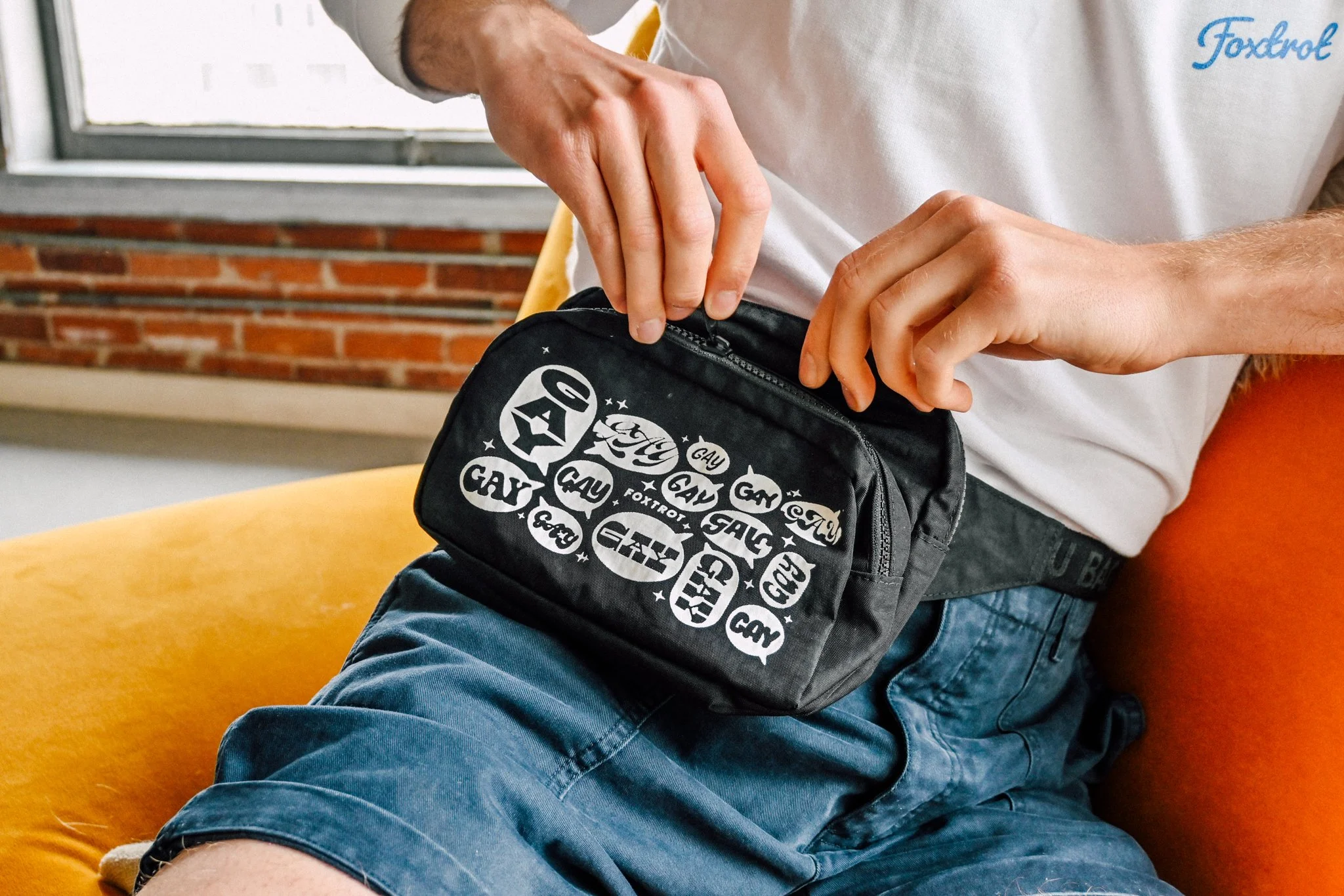
For Pride 2023, I partnered with Foxtrot Market to develop the "Say Gay" campaign, a bold and disruptive initiative aimed at combating anti-LGBTQIA+ legislation. As the designer, I created a typography-driven packaging concept featuring an eye-catching pattern of word bubbles filled with the word “GAY” — a direct, unapologetic statement of pride and visibility with 100% of proceeds going to GLSEN and Brave Space Alliance.
The campaign extended beyond packaging, transforming the design into a limited-edition fanny pack and greeting card, all available both online and in Foxtrot shops nation wide. The campaign resonated so strongly that the products sold out, proving its effectiveness in both impact and demand.
The design balanced bold, high-impact typography with a semi-translucent bag that allowed the rainbow-colored gummies inside to remain visible — an intentional design choice that lent itself to the designs colors and legibility. The fine details were carefully considered to ensure the packaging was both dynamic and commercially effective, making the "Say Gay" campaign a standout moment in Foxtrot Market’s Pride initiatives.
Client: VAM Studio
Role: Graphic Designer
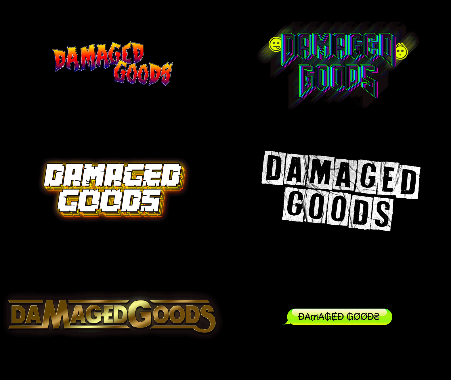
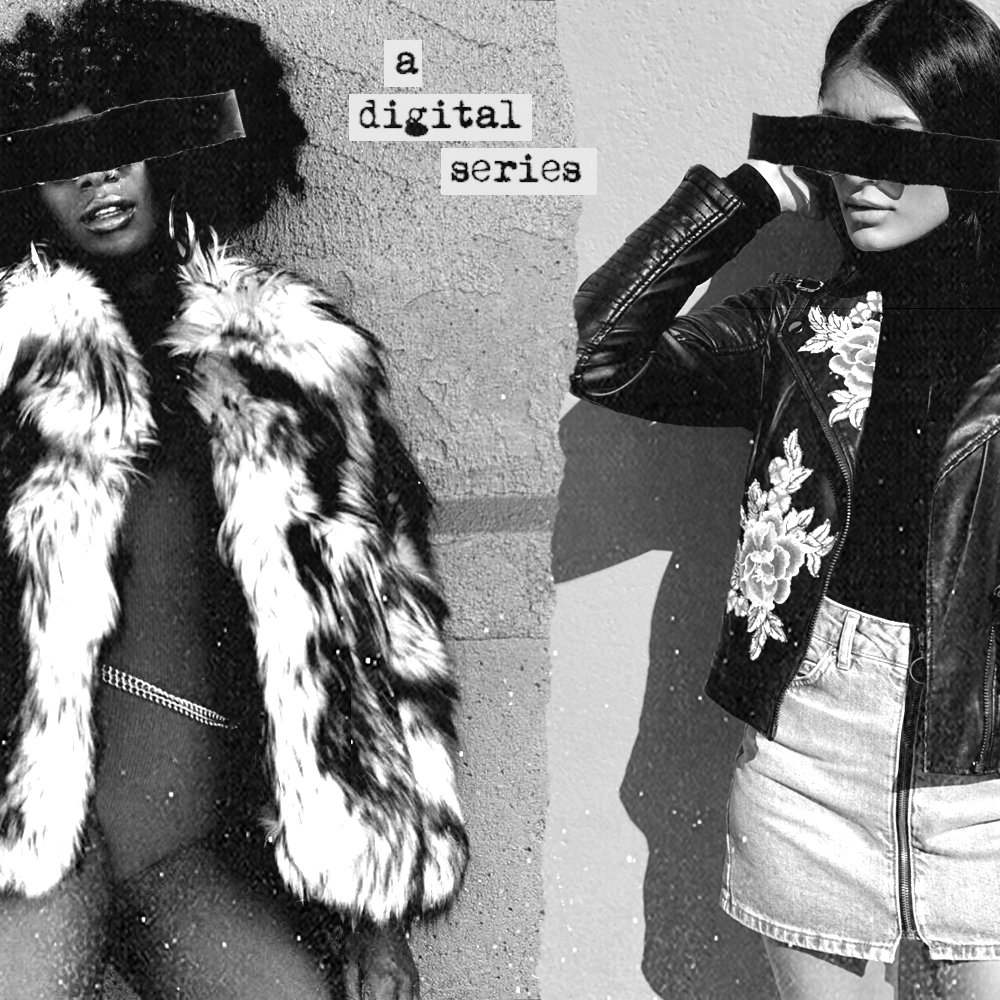
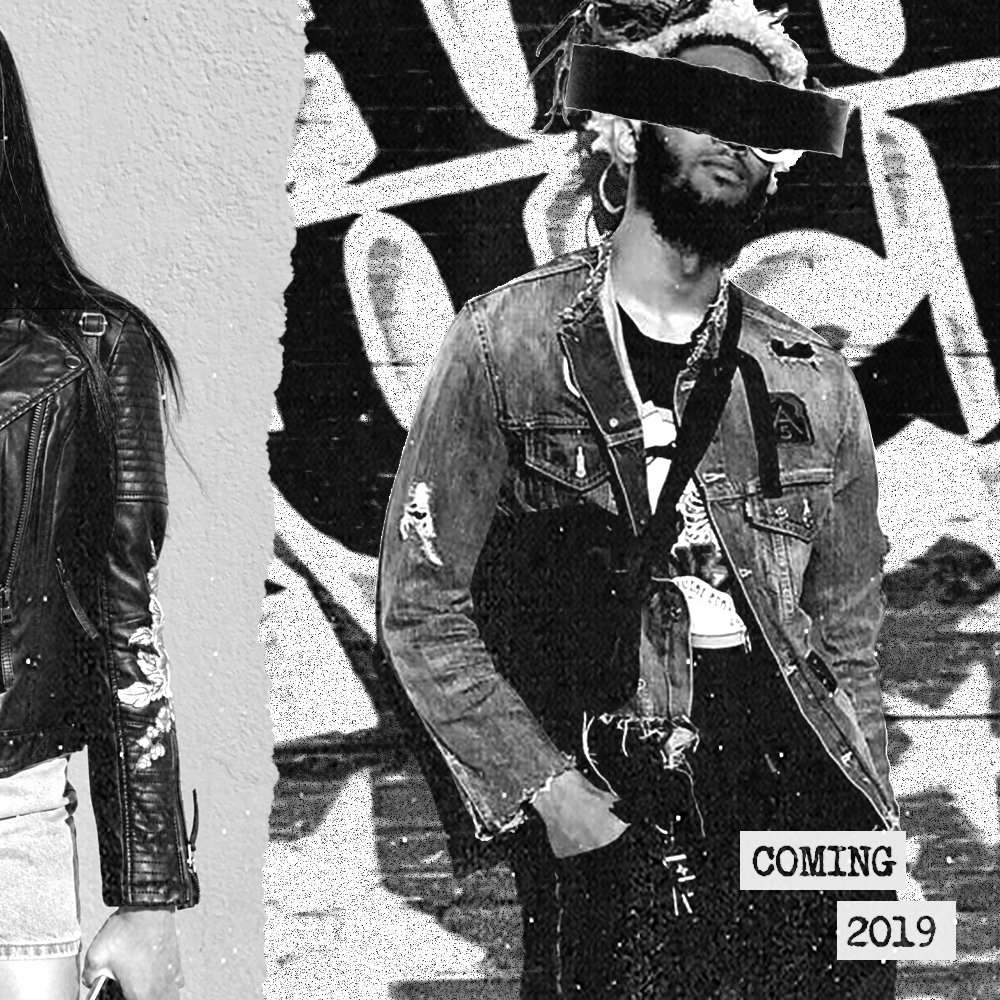
For the VAM Studio digital series Damaged Goods, I created a bold, psychedelic-inspired title design that reflects the show's chaotic energy and themes of identity, loss, and personal reinvention. Damaged Goods follows four messy Chicago roommates navigating total self-identity crises, pushing them onto unpredictable, individual paths. The bold, in-your-face typography sets the tone for the series’ dark humor and raw, unfiltered storytelling.
Drawing inspiration from typographer Tom Kan and the iconic titles of Enter the Void, this title sequence features alternative and pop-culture-driven typography infused with trippy, neon-soaked aesthetics. The lettering is distorted and high-impact, conjuring a drug-laced, hallucinatory feel that mirrors the unpredictable energy of the show's multiple protagonists.
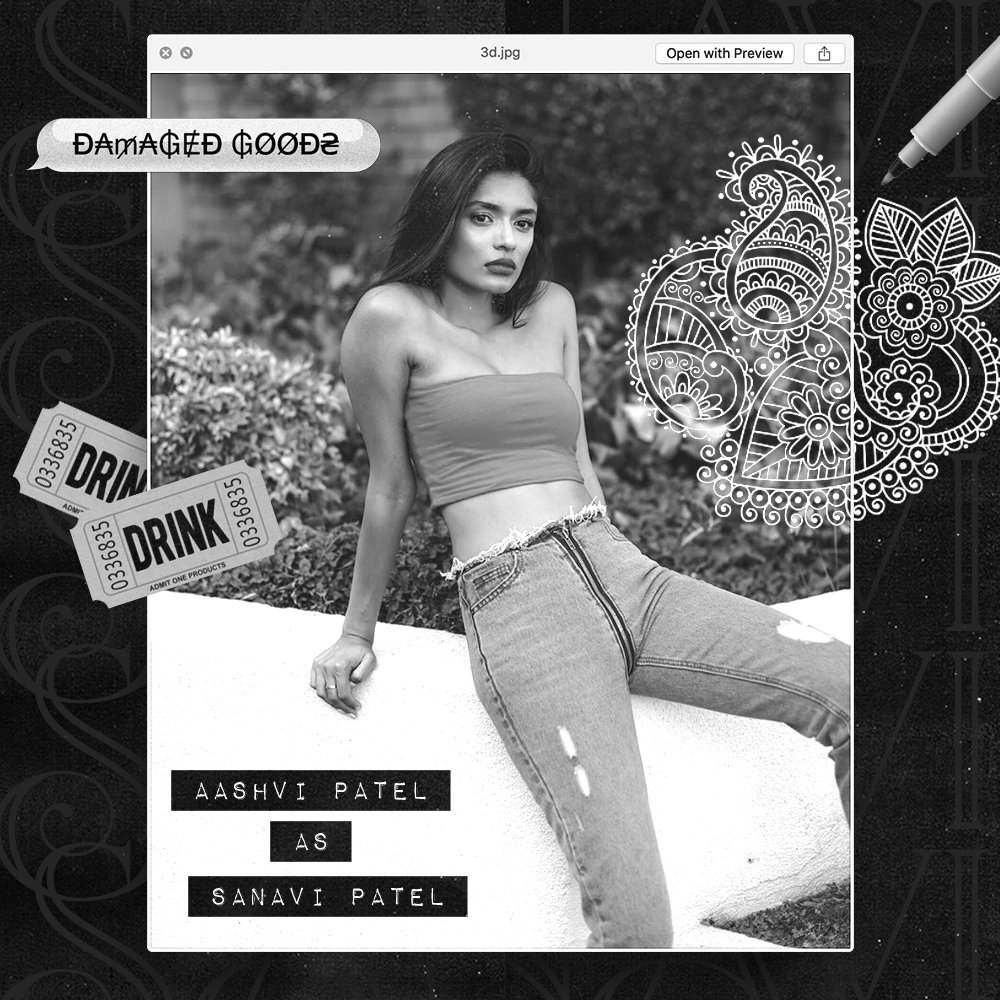
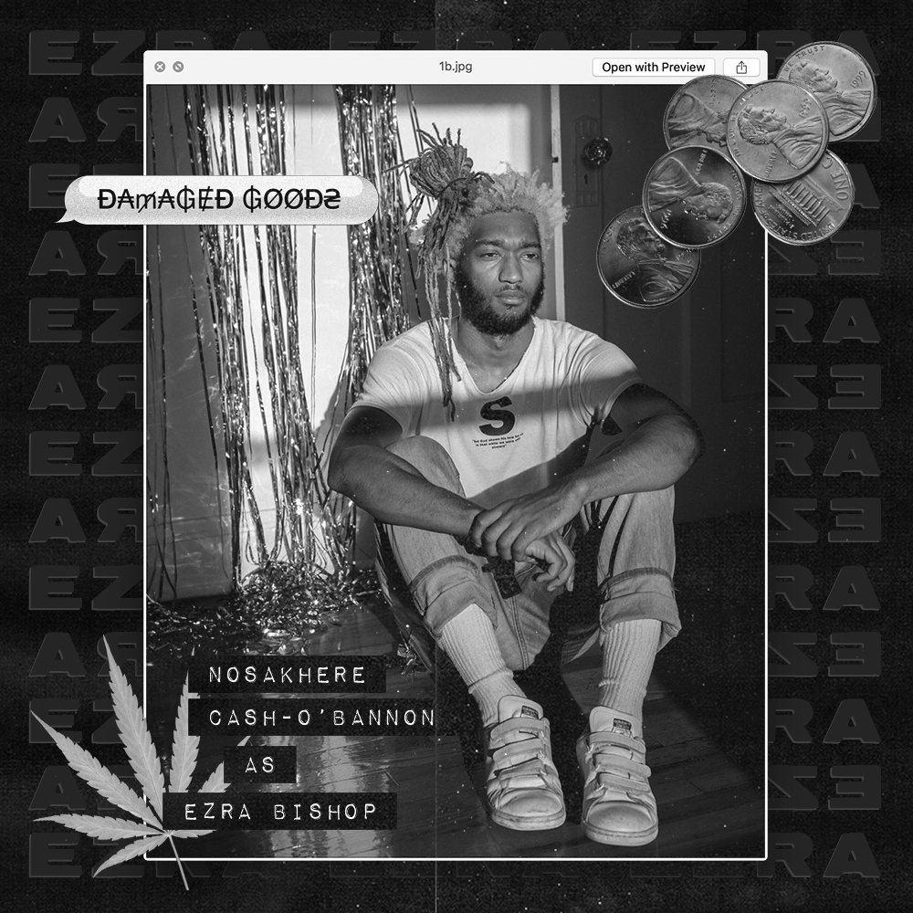
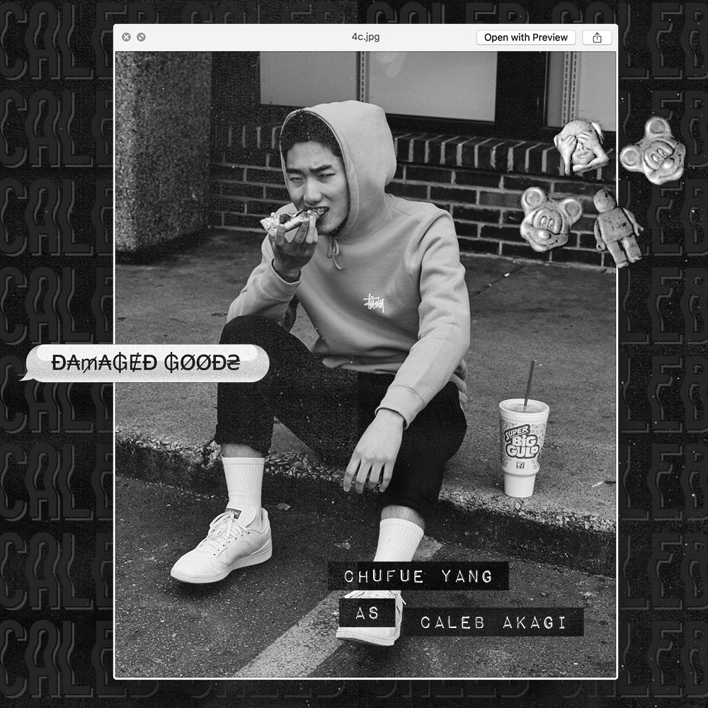
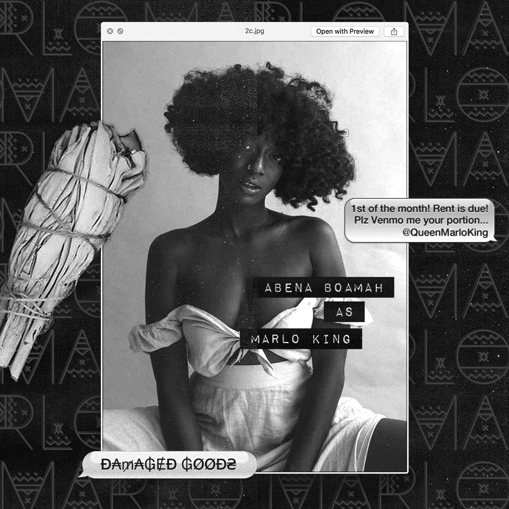
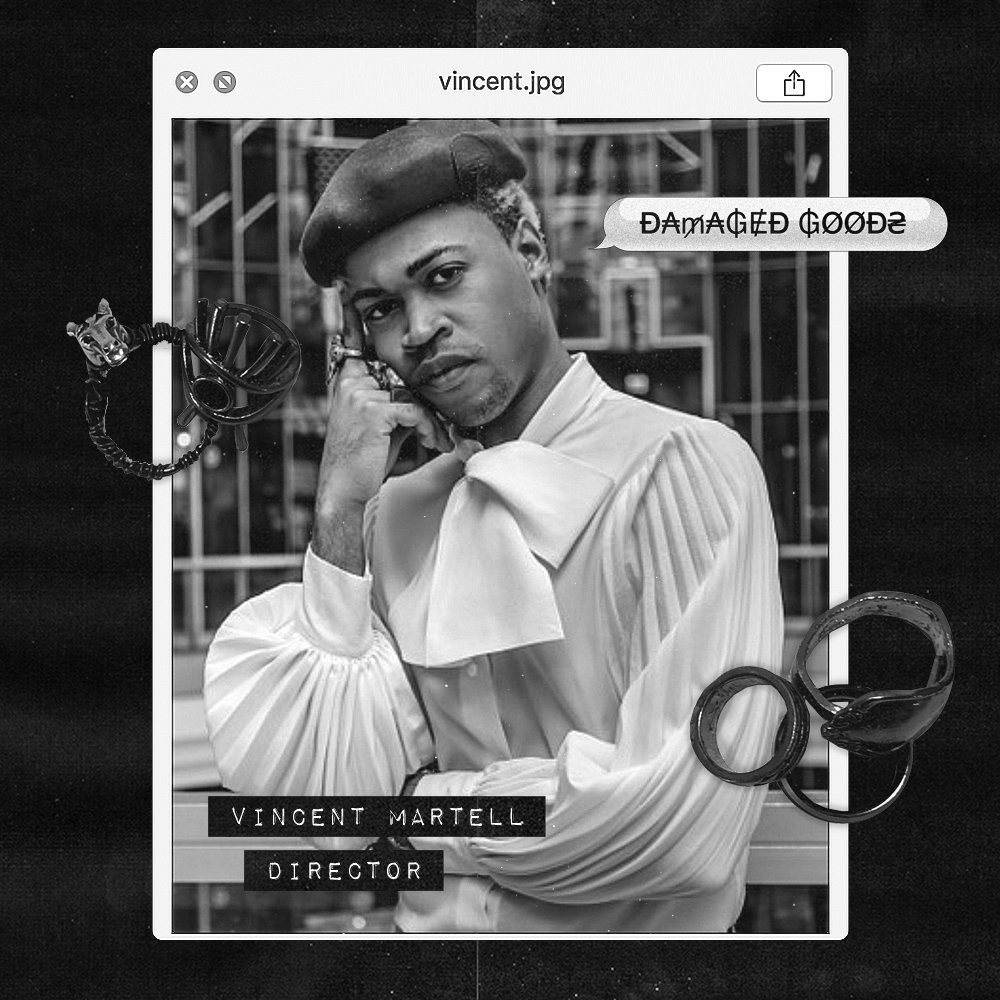
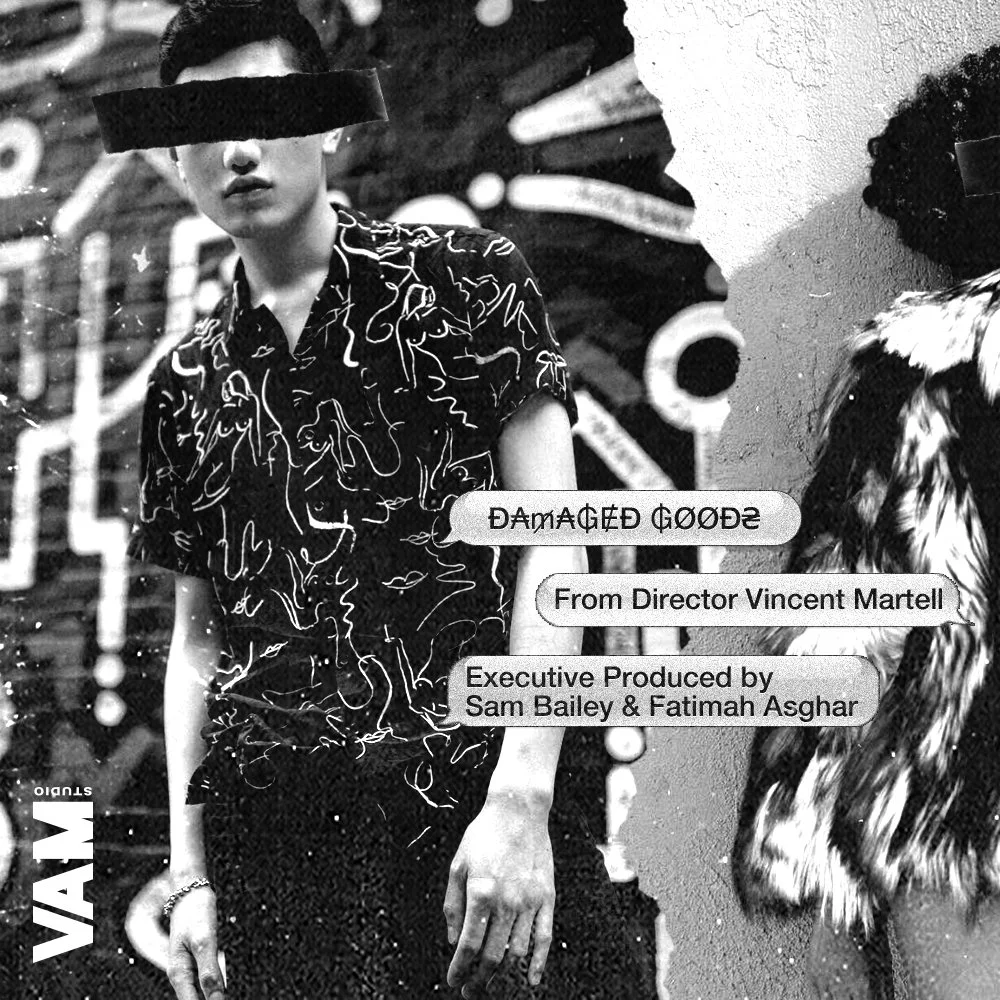
In addition to the title design, I created a series of personalized social media graphics for Damaged Goods teaser and launch, introducing each character and injecting their unique personalities. These graphics fused digital and analog elements, blending collage techniques, scanned items, layered textures, and handcrafted typography to create an aesthetic that felt both raw and meticulously curated.
This project was recognized with multiple award nominations, earning spots as an Official Nominee for: Best Digital Series – Webby Awards 2020, Best Indie Series – Streamy Awards 2020, & Best Digital Series – Queerties Awards 2020


